RESEARCH:
Paula Scher
Born 6 October 1948. An American graphic designer, painter and art educator in design:
From the Windows 8 to Tiffany & Co logo’s, Paula Scher is a huge name in the graphic design field. She is internationally known for her work and has been awarded more than 300 awards by several international associations, AIGA, the Package Design Council and The Type Directors Club. Her collection of work is showcased at New York MoMA, the Museum für Gestaltung and the Library of Congress in Washington, DC.


Her work with typography and projects are well known for eye catching designs and incorporating the use of modern technology in order to refine her works.

Her works have also been described as straddling the line between pop culture and fine art, where her graphic identities for Citibank and Tiffany & Co have become case studies for the contemporary regeneration of American brands. She is an incredibly influential female artist whose work inspires countless up and coming designers.
In the mid-1990s her landmark identity for The Public Theater fused high and low into a wholly new symbology for cultural institutions, and her recent architectural collaborations have re-imagined the urban landscape as a dynamic environment of dimensional graphic design. Her works are often socially and politically-motivated, delivering messages to mainstream society that challenge inequality and other societal issues.
April Greiman
Born 22 March 1948. A contemporary American graphic designer (prefers transmedia artist)
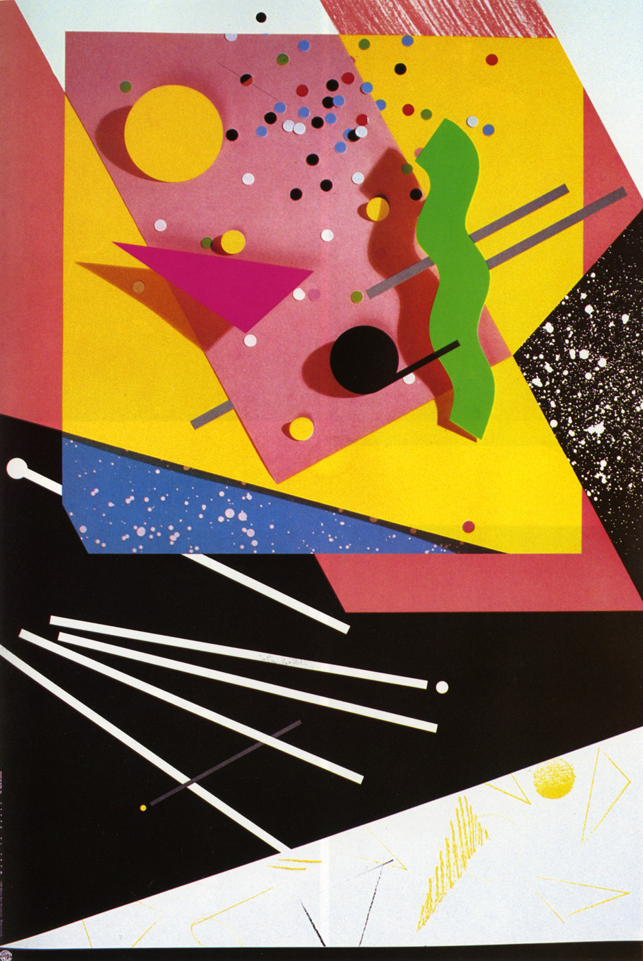
April Greiman is an American transmedia artist who is titled with being one of the first designers to embrace computer technology as a design tool. Her well known style includes typelayering but also combined with other objects such as shapes, photos, illustrations and colour swatches. Her style and chosen elements create a sense of depth and dynamic, in particular by combining graphic elements through making extensive use of Apple Macintosh technology. Los Angeles Times called her graphic style “an experiment in creating ‘hybrid imagery'”.
Greiman rejected the belief (that many contemporary designers had) that computers and digitalization would compromise the International Typographic Style.
Here she exploited, utilised and incorporated pixelation and other digitisation ‘errors’ as integral parts of digital art to challenge this belief amongst her peers. Her pieces touch on a range of subjects e.g. the human body, politics and science, and use a mix of interesting and eye catching elements.

via AIGA Design Archives
“April Greiman was a bridge between the modern and postmodern, the analog and the digital.”
Steven Heller
Today, Greiman is known as an artist creating numerous multimedia works for both solo and group shows as well as commissions for public spaces. Her work has been featured in museums and galleries around the world, and has been covered by everyone from the New York Times and Time Magazine to ESPN and PBS. She received her advanced design education at the Basel School of Design, studying with Wolfgang Weingart and Armin Hoffman, among others. Previously, she served as the head of the design department at the California Institute of the Arts. Greiman has been the recipient of numerous awards, including the AIGA gold medal for lifetime achievement and honorary doctorates from Kansas City Art Institute, Lesley University, Academy of Art University, and Art Center College of Design. She is currently serving as faculty at both Woodbury University School of Architecture and the Southern California Institute of Architecture. Greiman’s groundbreaking 1986 issue of Design Quarterly (“Does it make sense?”) is currently on display in the Walker exhibition Art at the Center: 75 Years of Walker Collections.

REFLECTION:
I have used a number of strategies to reference Bauhaus in my poster. Mainly through colour, angle, overlay and sharp lines. I began experimenting with bold blues, yellows and reds to compliment my strong and grungy alphabet typeface. Leading lines were also employed to encourage the viewer to see what I wanted to be salient; the word urban made from my alphabet. I found that overlapping and cropping my shapes in block colours helped to create a striking poster. With the overlapping of shapes, I experimented with transparency levels and the multiply layer filter to see how the colours could combine to create a different effect. I wanted to use circles and triangles, but I found that the poster became too busy and I lost the breathing room created by negative space. I ended up making triangles with the multiply layer effect with my parallelogram block shapes – which was an exciting outcome. I tried carrying the yellow right through to the bleed lines on my poster, resulting in a sense of scale and movement as the shape then looked cropped which I liked a lot too.
References:
April Greiman | Biography, Designs and Facts (2020). Available at: https://www.famousgraphicdesigners.org/april-greiman (Accessed: 7 April 2020).
April Greiman (2020). Available at: https://www.aiga.org/medalist-aprilgreiman (Accessed: 24 June 2020).
Paula Scher | Biography, Designs and Facts (2020). Available at: https://www.famousgraphicdesigners.org/paula-scher (Accessed: 7 April 2020).
Team, T. (2017) Behind the Scenes of Abstract: The Art of Design with Paula Scher | Creative Cloud blog by Adobe, Adobe Creative Cloud. Available at: https://blogs.adobe.com/creativecloud/behind-the-scenes-of-abstract-the-art-of-design-with-paula-scher/ (Accessed: 7 April 2020).
Paula Scher (2020). Available at: https://www.pentagram.com/about/paula-scher (Accessed: 7 April 2020).

Leave a comment